A support experience boxed in by Salesforce, service routes that changed from one locale to the next, no usage data to lean on, and a full overhaul already looming. The job: fix what we could meaningfully change now.
It came in as a quick facelift to bring the portal in line with the new brand. But the deeper I dug, the more real user issues surfaced, and they were too important to walk past while there were resources on the project. So I made the case to fix them properly.
With no analytics or research access, I leaned on the people who ran support day to day, the ones who knew where it broke. Their knowledge shaped what we prioritised: changes that worked within Salesforce, and that could land before the wider overhaul.
I was the designer on a small team, with a developer building alongside me and direction from the head of product support and the marketing department.
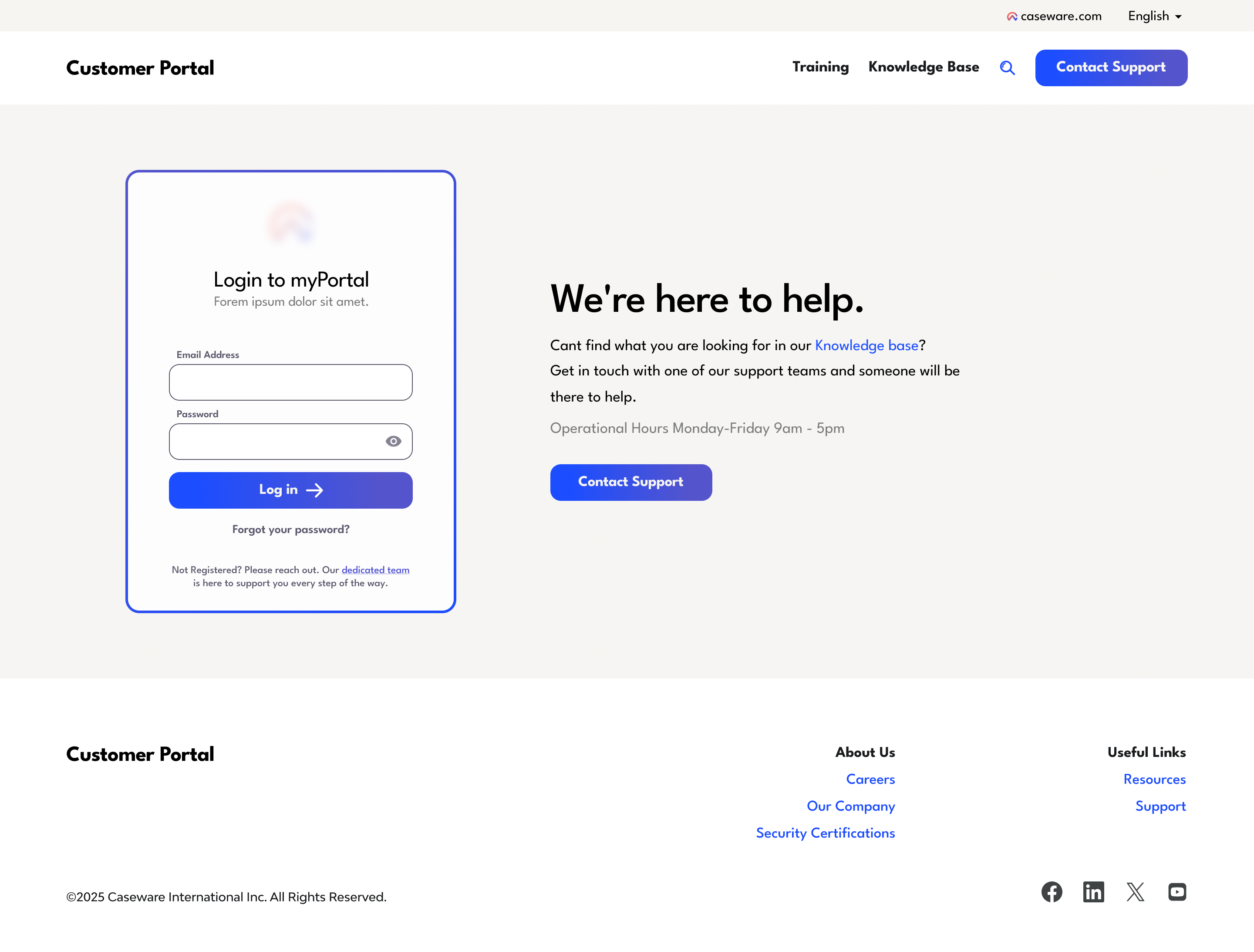
Everyone logging in is an existing, paying customer, and once they do, the support and the knowledge are tailored to their account. Driving more people toward that personalised experience was a real business priority. But the landing page worked against it. Three big cards pulled everyone toward generic support, while the one action we actually needed, logging in, was a tiny link in the top-right corner.
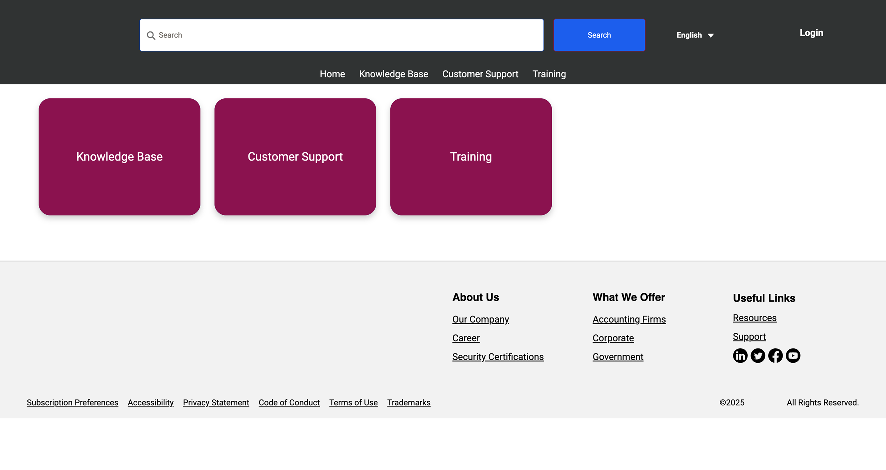
So people followed the path of least resistance into a general support inbox, and the team kept fielding the overflow. Worse, anyone who did reach the login but wasn't registered hit a dead end. A 'dedicated team' link dropped them onto a directory of hundreds of regional distributors. The funnel leaked at every stage.
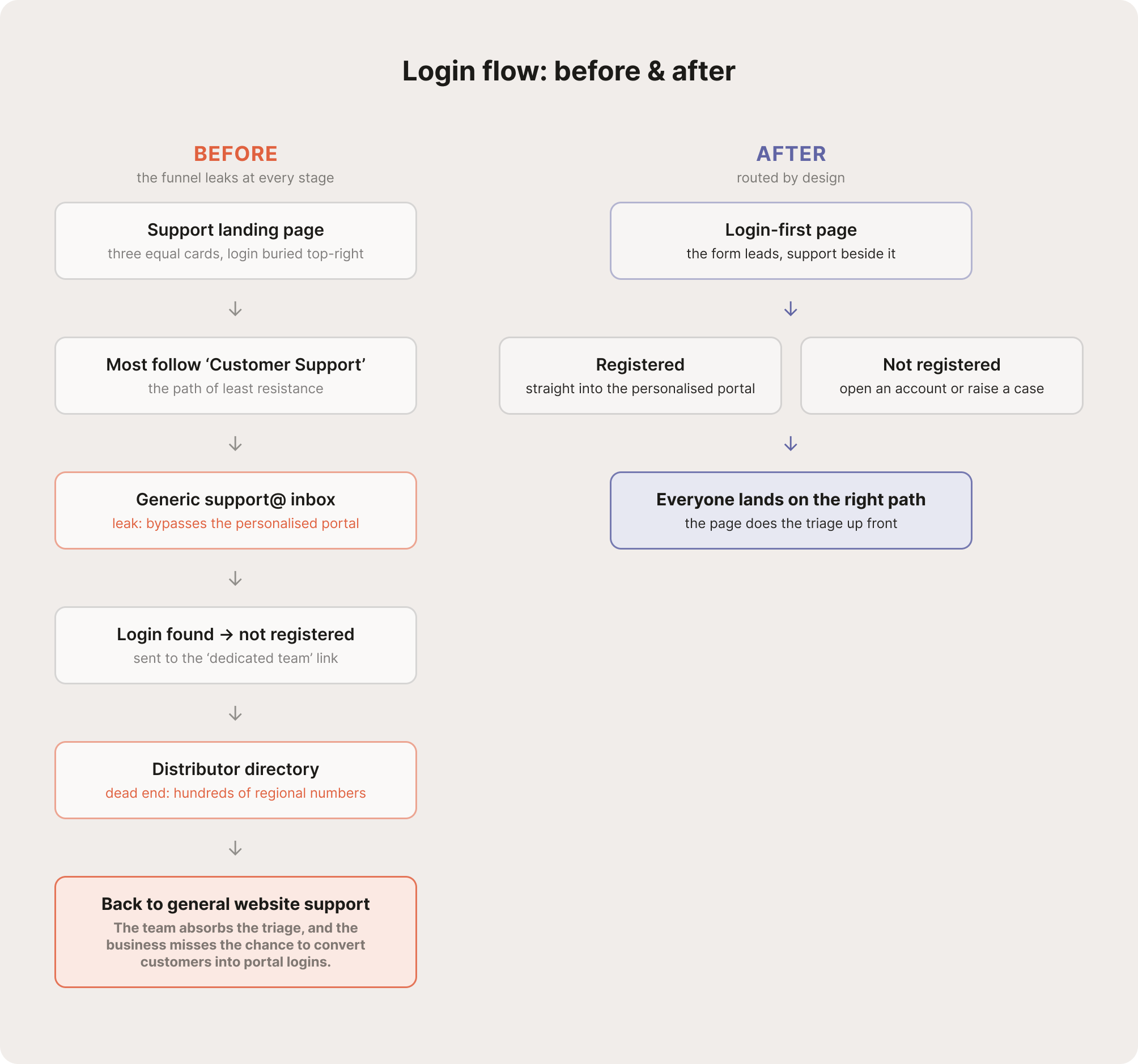
Login-first
Front and centre
The form now leads the page instead of hiding in the top-right corner.
Support as fallback
Help, as the second step
Generic support sits beside the login as a backup, with operational hours so people know when to expect a reply.
A way through
Everyone gets pointed somewhere useful
Unregistered users reach the help they actually need, whether that's opening an account or raising a case, rather than a list of regional distributors.
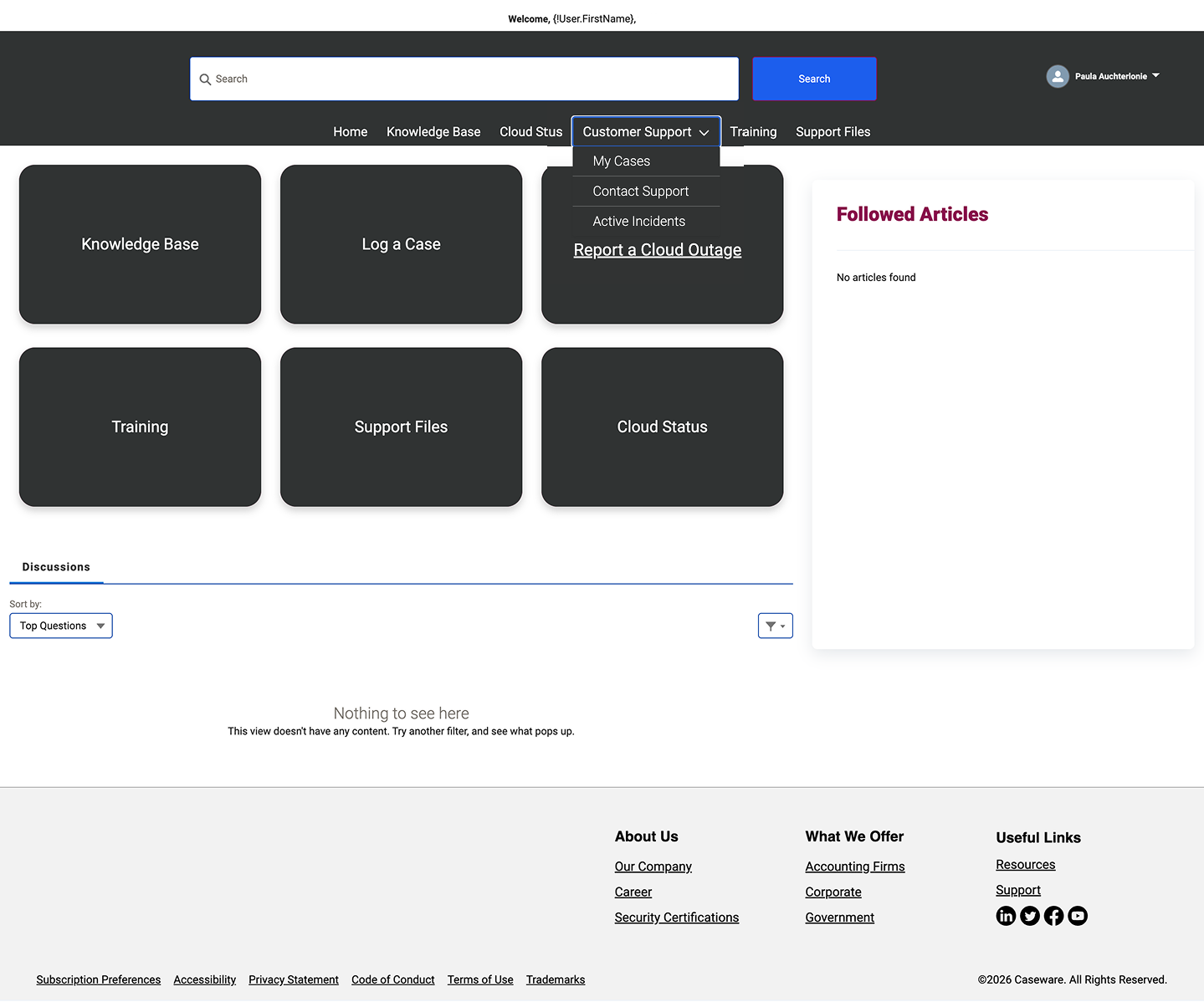
Customers arrived with one of two intents: to open or track a case, or to find an answer. The layout gave those tasks no more prominence than anything else, with several blocks duplicating the navigation and one sending users to an external page.
The hardest part wasn't the layout, it was a difference in instinct. The head of product support knew these users better than any analytics could, and he wanted everything surfaced in one place. He pointed me to help centres like BizTalk360's: a search bar sitting over a flat grid of every topic. That same instinct was probably why the original home had become a wall of equal-weight cards. So instead of overriding him or simply executing the brief, I designed a compromise. His principle held, nothing important is hidden, but the two real jobs now lead and everything else earns its place below.
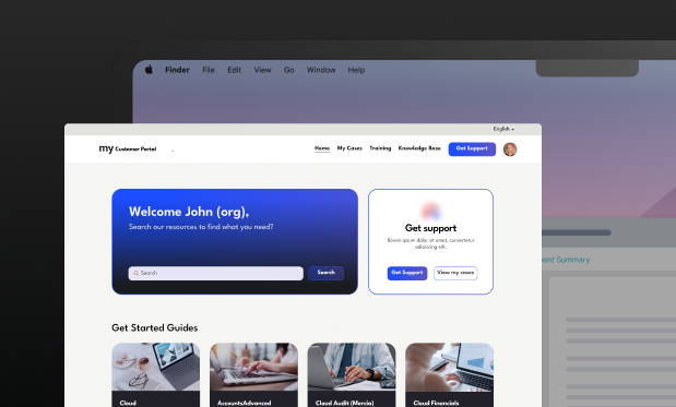
I rebuilt the home to prioritise what users actually need. The two core jobs, search and case management, now sit side by side above the fold. A real 'Welcome [name]' adds the personalisation the team wanted. The old nav-mirroring blocks give way to genuinely useful modules: tagged Training and Get Started Guides.
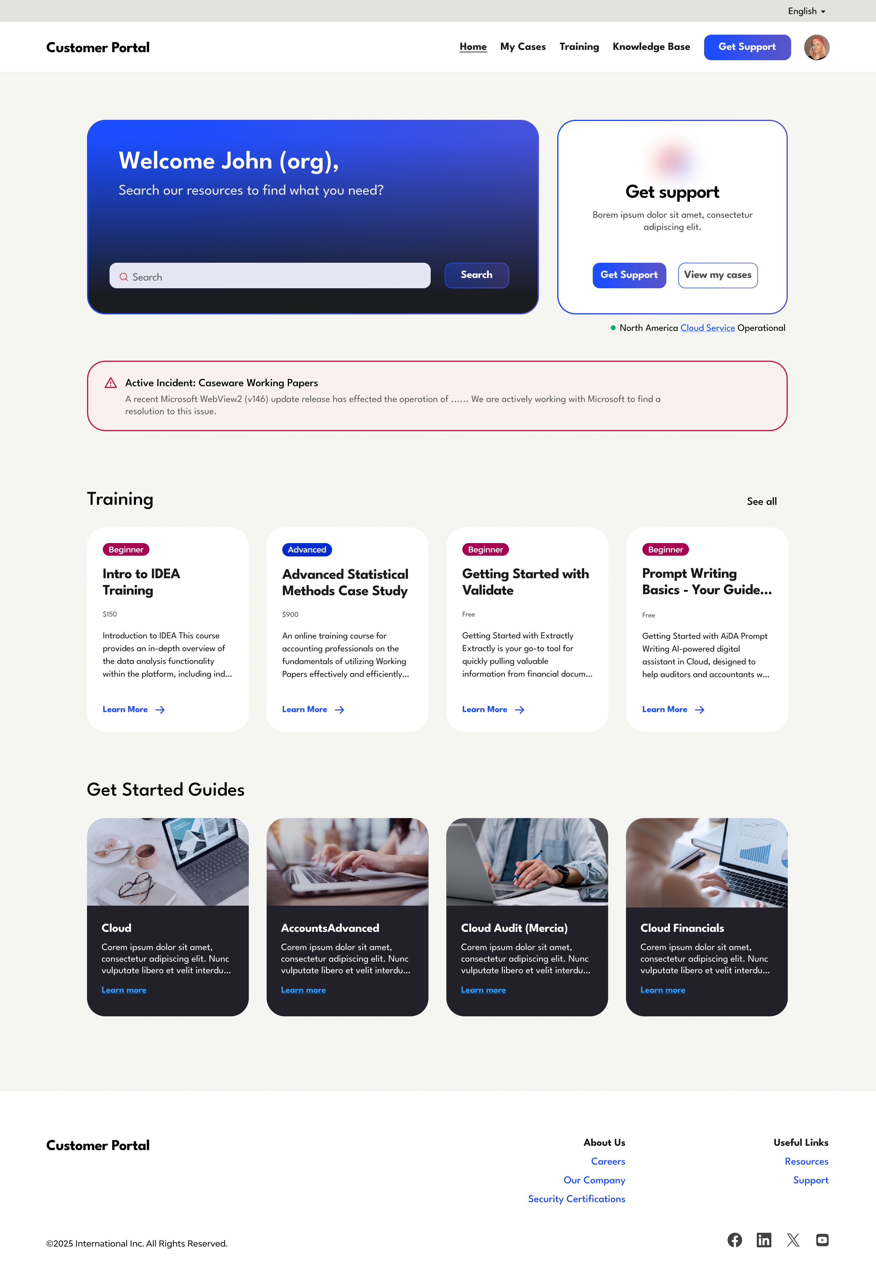
Before, working out whether the cloud was down meant active troubleshooting, and the external status page only reported global network status that often wasn't relevant to you. Now you can rule out one of the most likely causes at a glance, right where you'd reach for support: a green light confirming the service is operational in your region.
Together these absorb a real chunk of inbound. A lot of support traffic was simply people asking whether the service was down, or flagging an issue already known. Answering both before anyone reaches the contact form takes meaningful pressure off the team.
When something is wrong, an active incident banner now surfaces it up front. It names the issue and what's being done about it, so nobody has to wonder whether it's just them or whether anyone's already looking into it. For now it's posted manually for major incidents, and building a process to automate that is a planned next step.
I've contracted for this company for two years, and this was the first product I really got to take the lead on and restructure. It's the project where I felt my input genuinely shaped the direction and the overall user experience. Sometimes an outsider's perspective makes that easier: I could take my own confusion about the user journey and use it to make a strong case for change.
The redesign shipped. As a contractor I sat outside the post-launch measurement, and with no analytics to begin with there's no deflection figure I can claim. What I can point to is the work continuing: the project is about to switch platforms and integrate into the main website, opening up far more customisation, and I'm now designing the support agent for the same space. That's the part I'm excited to dig into next.