Late-night shows landing on the wrong date, hours of manual admin for site updates, zero organic search visibility, and 78% of visitors arriving on mobile.
Drom Taberna is a DIY music venue and Eastern European restaurant in Toronto. One of the few 4am venues in the city, it can host up to six bands in a single day. Tables become a dancefloor, cover charges shift through the night, and the same room holds a dinner service and a Balkan Brass session until 4am.
I came to this project with four years of context as a server and bartender, which meant skipping the discovery phase entirely. I knew this business inside out.
The client knew the site needed work. What exactly needed doing was less defined. My time working at Drom gave me enough context to identify the gaps and shape the scope myself. Their ask was a Squarespace refresh, but I knew something fully custom would be a better recommendation. My proposal wasn't a response to a brief. It was the brief.
Solo project. UX design, Webflow development, and Make.com automation from end to end. Client feedback from Drom's management throughout, working closely with the venue administrator to fit the integration around her existing workflow.
Two clear paths: a Squarespace refresh that would fix the surface without touching the underlying problems, or a custom Webflow build that would solve them properly. The recommendation was Option B. The only obstacle was budget. It was double what they had in mind.
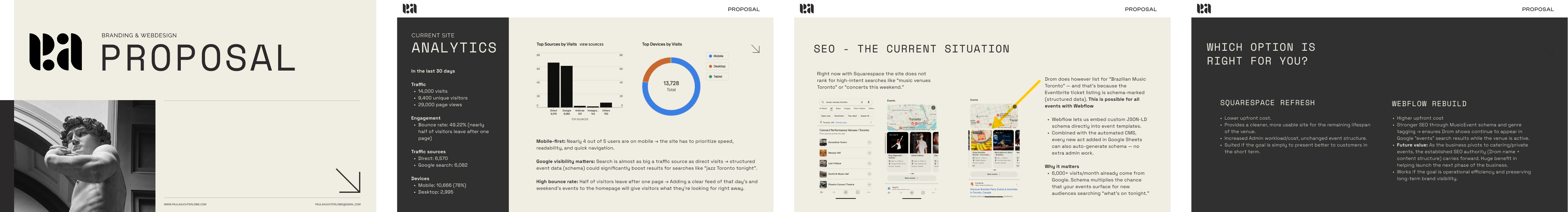
Staff were spending roughly three hours a week on manual show updates: adding acts, correcting dates, handling cancellations. At venue wages, that's around $3,000 a year. Squarespace offered no path to automate it. A custom Webflow build with Make.com integration would reduce that to near zero.
My proposal was accepted, proving the long-term value.
The sheet was the first design decision. The venue team already used a spreadsheet to log booking agreements, so the CMS input was built to mirror it exactly. A confirmed show transferred directly, with no reinterpretation required.
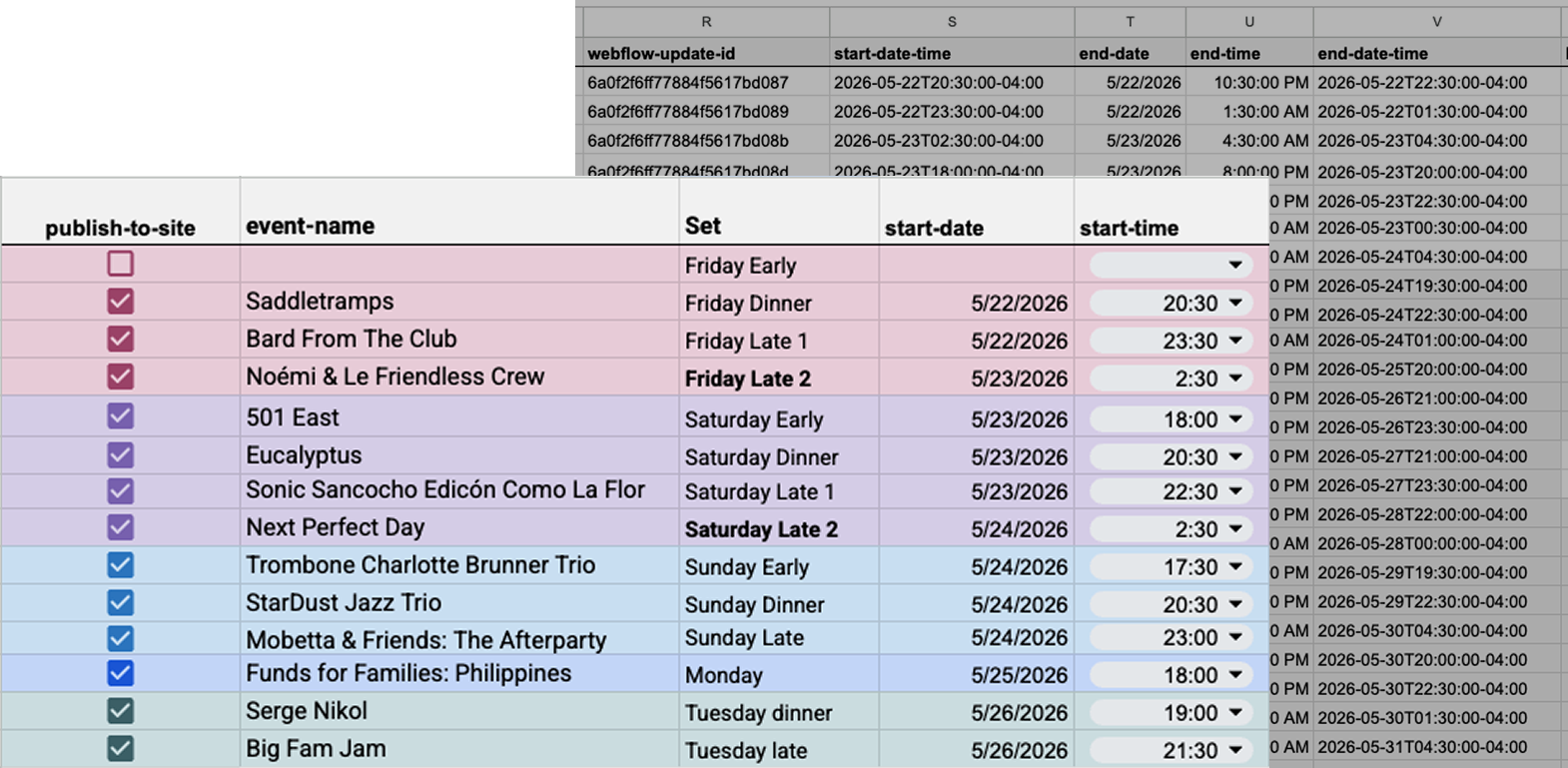
Colour-coding separates what staff enter from what the system handles. The Set field uses the venue's own language: Early, Dinner, Late 1, Late 2. A Saturday night can cross into Sunday, but the system maps to how the team thinks, not how the calendar does. Hidden columns handle the translation. Staff never touch them. Time fields are dropdowns for the same reason: one wrong character breaks everything downstream.

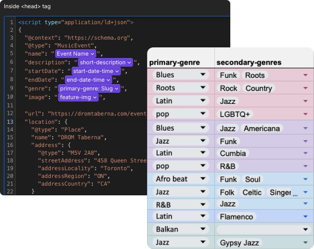
Genre had to serve two purposes at once. A primary genre handles schema markup and search visibility. A secondary multi-select gives guests the specific detail: the particular flavour of jazz playing on a Friday night.
Seventy-eight percent of visitors came from mobile, and by a wide margin the top search keyword was "Drom Taberna," meaning people were searching the venue by name. This wasn't discovery behaviour; it was people checking what was playing or pulling up the menu. And since live music was the venue's most distinctive draw, the schedule was the side worth leading with.
The original Squarespace site had a 50% bounce rate, which made sense given the structure: events were buried, so visitors who arrived with clear intent had to dig for what they came for. Putting the schedule front and centre aligned the page with what users were actually there to do.

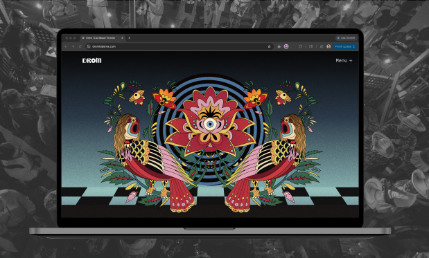
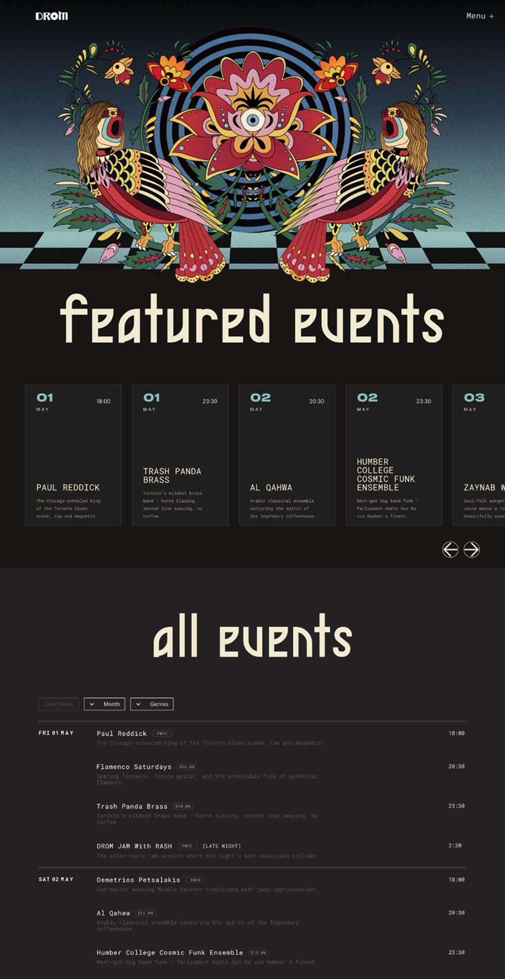
The hero is a full-bleed Lottie scroll animation, an illustration from an events poster that captures the venue's Eastern European roots and general eclectic spirit. But a scroll animation can be easily overlooked. A user who thinks the page is static has one natural next move: the menu. So the first item in the menu is a bold EVENTS title that drops them straight to the schedule. Two paths in, same destination. The visual impact stays. Nobody gets stuck.
Below the hero the homepage splits into two: a featured events carousel for ticketed shows and staff picks, and a full chronological list with filters. The carousel showcases the best of what is on offer. The list gives guests what they came for. With around 100 shows a month, the split keeps the page from becoming a wall of events.
Built for a venue that runs seven nights a week. Month and genre filters let guests narrow quickly while still leaving room for discovery. Genre uses both the primary and secondary fields from the data layer: broad enough to find Jazz at a glance, specific enough to surface the subgenres that make a show worth seeing. Selected states are visible and clearable in one tap.
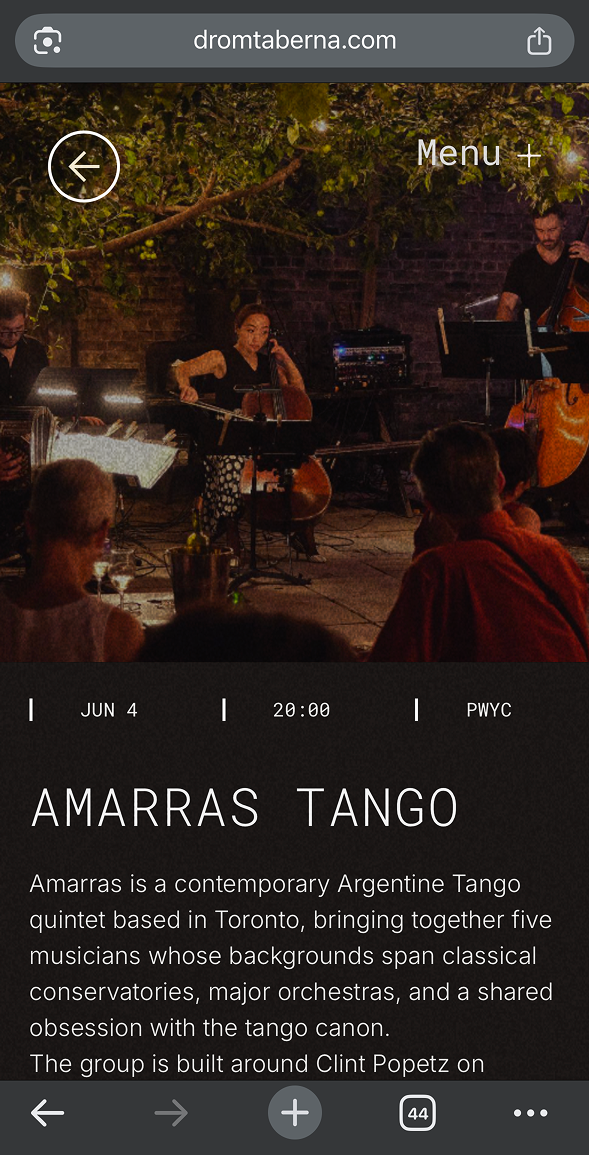
Artist images come directly from the acts themselves, so aspect ratio is never guaranteed. A 1:1 crop keeps the layout consistent regardless of what lands in the CMS. Previous and next navigation lets guests browse the schedule without returning to the list.
The menu is long. A sticky jump bar lets guests navigate between sections on mobile, built for the person checking it at the table when physical menus run out.
Complex rules about cover charges, table release, and late-night shifts lived in a paragraph nobody read. The same information, restructured into a scannable 4-panel grid.
01
Cover
02
Schedule
03
Late night
04
Payment
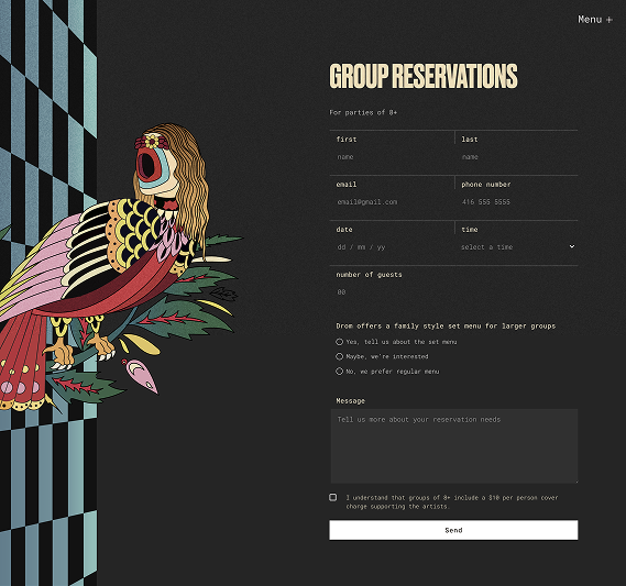
Drom is both a music venue and a restaurant, so a single catch-all form wasn't enough. Each form is scoped to a different recipient with exactly the right fields. The artist submission checkbox reduces back-and-forth for the booking team. Group reservations gives buffet style options and general enquiry filters down the purpose.
Once I had a clear framework, I translated it into a set of wireframes. These wireframes acted as the app's skeleton, focusing on functionality rather than aesthetics.
I iterated on these wireframes, ensuring the app felt intuitive even at this low-fidelity stage. For instance, I simplified navigation by reducing the number of taps needed to reach key functions, and I tested different layouts to prioritize content clarity.

The site launched in May 2026. Post-launch data is still accumulating, but a full year of Squarespace analytics was collected before the migration — giving a solid baseline to measure against as the new site builds history. The automation is live. Staff admin is near zero. Every event generates schema. The before/after comparison will come.
View SiteThis is a learning project as much as a client project. The fee was negotiated up from the original ask, but it still fell short of the hours the technical scope required. The trade-off was deliberate: working with a business I already knew made it a safe place to build something genuinely complex. Functional automation, real business value, applied UX thinking across the whole build. Worth the gap.
The visual design is still a work in progress. There are inconsistencies I can see clearly, particularly in the heading treatment, and the site feels like it's being pulled in two aesthetic directions. That's the next thing to resolve.
Post-launch iteration is where assumptions get tested. Honest feedback, unexpected usage patterns, things the build phase couldn't surface. This project still has a lot of that ahead.